
Wednesday, 11 November 2015


Friday, 6 November 2015
Colour Moodboard Analysis
Colour Mood board Analysis
In this mood board I have selected all of the colours that
my survey produced- black, white, red, yellow and blue- and then selected
several shades of these colours which I think would be appropriate for the
magazine. These include bright, dull and light shades of red, yellow and blue.
I feel that all of these colours mix and match well and that white and black
will be staple colours for my magazine, such as overall font. The other colours
may be used for key words, borders and backgrounds. This will allow my magazine
to be easily read and understandable. I believe that black is the most
appropriate colour to use throughout my magazine as it was the most chosen in
my survey and it is popular amongst the teens of today. I also believe black
links in with the indie theme and could be used well together with white. Blue
is the second highest colour selected after white, so I collected several
shades to experiment with. I believe I will use a fairly dull, but appealing
blue to attract the audience without using extremely bright colours which could
be seen as unprofessional and too overwhelming on the page- also making the
magazine hard to read.

Font Moodboard Analysis
Font Mood board Analysis
I have chosen these fonts from DaFont, as they appeal to me
and would make a good, aesthetically pleasing masthead, which the audience will
be able to recognise. I find the fonts very clean cut and this makes them
typical of a normal masthead, which is clear and understandable for the
audience to read. I believe that the masthead suggests a gender neutral
magazine, as none of the fonts are stereotypically feminine or masculine. I
have chosen a selection of capitalized and non-capitalized fonts, as I am
unsure which would be more appropriate for an indie orientated audience.
However, I feel that I will choose a font with black, capital text, because
they are bold and will attract the target audience’s attention. All of the
fonts chosen are modern and sans-serif, so they will be more appealing to my
target market of teen audience and give it a fun and new appearance. These
fonts are also easily able to be manipulated and adjusted with different
colours if I needed to. Although the majority of these fonts are fairly basic
and plain, I feel they will be effective for my masthead and my target audience
will find them appropriate.

Wednesday, 4 November 2015
Original Ideas Statement
Original Ideas Statement
I am going to make an indie band music magazine, however it
may also include some fashion due to the high amount of votes in the
questionnaire and my love for fashion. I have chosen an indie band magazine as
I feel this is the current, popular genre for teens. I will also be able to
create a magazine which is suitable for the audience as I am the same age as
the majority of the target audience. This will help make the magazine more relevant
as I will have a better understanding of the audience’s viewpoint. It is going
to include freebie band posters and may also include some indie artists, not
just indie bands. I feel it will mainly include indie rock bands and the main
feature will be a popular, indie band interview. My intended target audience is
for older teenagers and will be a gender neutral magazine.
Monday, 2 November 2015
Magazine Publishers
Magazine Publishers
TimeInc UK
 TimeInc, formerly known as IPC Media, is one of the most popular magazine publishers of print and digital magazine. They connect with over 120 million users world wide every month; and TimeInc UK engage with almost half of adult population in the United Kingdom, through their various media. TimeInc publishes over 90 iconic brands in print and a few digital-only titles such as MyRecipes, MIMI and TheSnug. TimeInc UK contributing to around 60 ionic brands and some of their most popular magazines include the well-known, iconic music magazine- NME; the second largest, actively purchased UK magazine- What’s on TV; and Horse & Hound, a magazine interesting 1.2 million equestrian enthusiasts. Most of of the magazines published are specialist, with 31 magazines more aimed at the male target market. However, they also publish two other core categories: lifestyle and luxury, which are more aimed at a female target audience. Only two music magazines are published by TimeInc: NME and Uncut, which is a magazine attracting rock fans. which is The company has been running since 1968 and has accumulated an audience more than 120 million in global print monthly and the same amount being attract to the digital experiences on mobiles and tablets online. There are 50 websites which they are involved with including their own news based site- time.com. TimeInc is based in the USA, however this is the parent company of TimeInc UK based in London. In 1990, TimeInc did actually join Warner Communications to form TimeWarner, however much recently, this media merged company is no longer.
 Condé Nast

 Condé Nast is a mass media company based in New York, with 21 influential and upmarket brands to share to a huge, global audience of 115 million in total, both from print and online. This is due to its several fashion and lifestyle brands which have become increasingly iconic, such as the famous- ‘Vogue’ fashion magazine, Vanity Fair, GQ, Glamour and Teen Vogue which are other popular, recognisable fashion names. Condé Nast was founded in 1909 by Condé Montrose Nast, and to this day the media company still receives several awards in the industry. It has reached record profits, with the numbers still increasing due to the company’s fast growing nature. Apart from its main focus of fashion/lifestyle media, the other publication themes include home, bridal, golf, food, travel, technology, culture. Also, it has most recently added the only music themed publication under its umbrella of brands so far, called Pitchfork. This is an online music magazine covering independent, indie music. Although this is one of the newest, not as popular brands, it is estimated to increase its popularity due to being associated with the new owners Condé Nast. Condé Nast also has a twitter page with over 70.4 thousand followers to increase the popularity of the brands it owns, posting daily to notify its widespread audience.
 Bauer Media

Friday, 23 October 2015
Advertisers Mood Board Analysis
Advertisers Mood Board Analysis
In this mood board I have tried to select brands and companies that may apply to my target audience, focusing mainly on making the brands appropriate for teenagers. I have included several brands to associate with their likes and interests. For example, as my audience are fans of constantly listening to music, I have included the company logos, products and shops which sell music in different forms. These are things such as the Apple Company, which sell iPods and have iTunes for music to be downloaded from; Gibson, a company that sells musical instruments and Marshall for buying amps; Beats by Dr Dre that are headphones for listening to music; Spotify Premium, a music streaming account; HMV and BBC Radio 1. I also included fashion brands that may want to sell their clothing to teens in particular such as ASOS, Doc Marten, Topshop, Urban Outfitters and H&M. Other brands included are relevant to my target audience age such as restaurants like Wagamamas, Subway and McDonalds or other specific companies. These could be things such as TV companies which show more teenaged film or programmes, like Film4 or E4. Another important advertiser would be technology companies producing cameras for teens to capture gig moments such as Canon and Samsung.

Target Audience Mood Board Analysis
Target Audience Mood Board Analysis
In this mood
board I have tried to convey the stereotypical style and likes of my target audience-
teenagers with an indie style. I feel this mood board portrays both genders as most
likes are shared with the exception of some clothing. I have included images of
bands and their album covers to have a sense of the bands they like to listen
to such as: Circa Waves, The Wombats and The Maccabees. Also, I have included
how they like to listen to their music. Although they like listening to their
iPods, they prefer going to record shops and buying vinyl to play on their
record players. I have also tried to include their interests and hobbies, these
are typically things such as going on Tumblr (a bloggers site), playing guitar,
going to gigs and listening to their music. They also like reading biographies of
artists and most commonly, indie aimed music magazines such as NME. The fashion style of an indie teen is also
shown, such as the Kanken rucksacks, band t-shirts, doc martens, converse and
other indie styled clothes. Not only have I shown their dress style, but also
their preferred room style with band posters and gig tickets on the walls
alongside their minimal bed decoration.

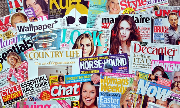
The Magazine Industry
The Magazine Industry

 It is a fact
that 10,000 magazines are sold every minute, so it’s no surprise to find that
the UK magazine market alone is worth a grand 4 billion pounds. Three quarters
of adults in the UK buy a magazine, whether it may be one created by local
supermarkets such as Tesco, TV guide magazines or a Woman’s Weekly magazine. It has
been found that 43% of Great British adults consume women’s monthly magazines
and that women’s weekly magazines make up more than half of the top 10 selling magazines.
The audience of a magazine is also increased by 50% from online magazines and
58% of online consumers trust the magazine ads and buy from them. 27% of
consumers learn about new products from magazine advertising, however the
companies pay a heavy fee to show their work on some of the pages. It can cost
up to $6,225, just for a four-colour double page spread, as it’s in a premium
position for readers to view it. The
smallest sum of money for a space in an average magazine can cost $665, only
for 1/8 of the space on a page in black and white. In British pounds this is
equivalent to£4019.63 for the most expensive ad and £429.43 for the cheapest
one. Prices can vary due to the popularity of the magazine, for example,
Entertainment Weekly is the number one top music magazine, closely followed by
the Rolling Stone. An advertisement place in these may cost higher than the
less popular ones, such as Mix Mag and DJ at the bottom of the top 10. In
general magazine ratings, “TV Choice” and “What’s on TV” have the largest sum
of newsstand copies sold, bringing in over one million pounds each with the largest revenue
in general being “What’s on TV” with £30.5 million. Overall, the magazine
industry brings in a large amount of money and it is not to be underestimated,
even with the rise in technology.
It is a fact
that 10,000 magazines are sold every minute, so it’s no surprise to find that
the UK magazine market alone is worth a grand 4 billion pounds. Three quarters
of adults in the UK buy a magazine, whether it may be one created by local
supermarkets such as Tesco, TV guide magazines or a Woman’s Weekly magazine. It has
been found that 43% of Great British adults consume women’s monthly magazines
and that women’s weekly magazines make up more than half of the top 10 selling magazines.
The audience of a magazine is also increased by 50% from online magazines and
58% of online consumers trust the magazine ads and buy from them. 27% of
consumers learn about new products from magazine advertising, however the
companies pay a heavy fee to show their work on some of the pages. It can cost
up to $6,225, just for a four-colour double page spread, as it’s in a premium
position for readers to view it. The
smallest sum of money for a space in an average magazine can cost $665, only
for 1/8 of the space on a page in black and white. In British pounds this is
equivalent to£4019.63 for the most expensive ad and £429.43 for the cheapest
one. Prices can vary due to the popularity of the magazine, for example,
Entertainment Weekly is the number one top music magazine, closely followed by
the Rolling Stone. An advertisement place in these may cost higher than the
less popular ones, such as Mix Mag and DJ at the bottom of the top 10. In
general magazine ratings, “TV Choice” and “What’s on TV” have the largest sum
of newsstand copies sold, bringing in over one million pounds each with the largest revenue
in general being “What’s on TV” with £30.5 million. Overall, the magazine
industry brings in a large amount of money and it is not to be underestimated,
even with the rise in technology.Tuesday, 13 October 2015
NME Magazine Analysis
NME

 NME stands
for the new musical express and it has been published since March 1952 by
TimeIncUK. It has overseen a lot of changes to content and the type of music it
has shown, however it remains the worlds most recognized, iconic music
magazine. It has become recognisable by the red masthead which has remained
similar- with only slight variations- since 1978. Only 25 years later after it first became
published, it had become a music newspaper which gave the youths of the
population a place to keep in touch with the latest music throughout the years.
The company transformed from a newspaper format to a magazine leading up to
1998 and after that it has remained a popular magazine, even due to complications
with competing brands at the time. Keeping up with the modern days, they also
created an online version- NME.com- which has accumulated since 1996, to seven
million users online every month. They have had an app made and it has also
joined social media, with 586,275 likes on Facebook and 790,000 Twitter
followers. NME created the first ever UK Singles chart and it now focuses on
the latest rock, alternative and indie music. Statistics show that the median
age of readers is 25 and the majority of readers are men, however the magazine
is loved by all and even won the “Music Media Brand of the Year”, recently in
2013. Another recent change has shown the current editor, Mike Williams, giving
away the magazine for free from September 2015 due to the lack of funds the
magazine had produced, despite its popularity. NME has been described as: “The
magazine at the forefront of music culture”, and they have known to launch the
careers of some of the largest acts in the world, such as The Killers, Arctic
Monkeys and Florence and the Machine. They have not only displayed popular acts
in the magazine, but also created the NME Awards, Shows & Tours to
spotlight their acts to over 215,000 music fans annually.
NME stands
for the new musical express and it has been published since March 1952 by
TimeIncUK. It has overseen a lot of changes to content and the type of music it
has shown, however it remains the worlds most recognized, iconic music
magazine. It has become recognisable by the red masthead which has remained
similar- with only slight variations- since 1978. Only 25 years later after it first became
published, it had become a music newspaper which gave the youths of the
population a place to keep in touch with the latest music throughout the years.
The company transformed from a newspaper format to a magazine leading up to
1998 and after that it has remained a popular magazine, even due to complications
with competing brands at the time. Keeping up with the modern days, they also
created an online version- NME.com- which has accumulated since 1996, to seven
million users online every month. They have had an app made and it has also
joined social media, with 586,275 likes on Facebook and 790,000 Twitter
followers. NME created the first ever UK Singles chart and it now focuses on
the latest rock, alternative and indie music. Statistics show that the median
age of readers is 25 and the majority of readers are men, however the magazine
is loved by all and even won the “Music Media Brand of the Year”, recently in
2013. Another recent change has shown the current editor, Mike Williams, giving
away the magazine for free from September 2015 due to the lack of funds the
magazine had produced, despite its popularity. NME has been described as: “The
magazine at the forefront of music culture”, and they have known to launch the
careers of some of the largest acts in the world, such as The Killers, Arctic
Monkeys and Florence and the Machine. They have not only displayed popular acts
in the magazine, but also created the NME Awards, Shows & Tours to
spotlight their acts to over 215,000 music fans annually.Tuesday, 6 October 2015


Analysis of the Questionnaire Results
Questionnaire Analysis
It appears
that the current college magazine isn’t effective, as 90% of the students said
that they didn’t read it, so this means that a new magazine needs to be put in
place. 85% of people said they would pay up to 50p for the magazine, however
most students preferred it to be free. 60% of the people surveyed said they
would like the magazine to be published every fortnight or monthly and this
would be suitable if the magazine had a price. The five most popular topics
picked, that they would like to see in the magazine were: student advice or
tips, a gig guide, college events, local events and fashion. Students were also
asked which colours would attract them to the magazine, with the top colours
being: black, white, blue, red, purple or pink. A large percentage of students
(95%) said they would like to have a “latest jobs” page within the magazine,
with only 5% saying that they would not like one. When choosing the cover
image, 75% of the people taking the survey stated they would like to see a
student or student work on the cover.
The question of which font to use was inconclusive, however with the
target age being teens, a modern and contemporary font would be most suitable.
Also a font that is clear and understandable to read would be appropriate.
Lastly, the name of the magazine wasn’t very specific in its results, yet a
masthead including “EN” OR “East Norfolk” occurred more frequently than any
other words.
College Magazine Questionnaire
College Magazine Questionnaire
1. Do
you read the college magazine?
Yes / No
2. What
would you like to see in the magazine? (Tick 3.)
o
Student
Advice/Tips
o
Subject
Advice
o
Fashion
o
Problem
Page
o
Local
Events
o
Gig
Guide
o
Technology
o
Film
Reviews
o
College
Events
o
Sports
News
3. How
much would you spend on a college magazine?
o
Nothing
o
50p
o
£1
o
£2
4. How
often would you like the magazine to be published?
o
Every
Week
o
Every
Fortnight
o
Every
month
o
Every
Half Term
5. Would
freebies encourage you to buy the magazine?
Yes / No
6. What
image would you like to see on the front cover?
o
Student
o
Teacher
o
Student’s
Work
o
Technology
o
Nature
7. What
would you like the magazine to be called?
…………………………………………………………………………………………………………………………..
8. What
colours would attract you to the magazine? (Choose 3.)
..……………………………/………………………………………/………………………………..
9. What
fonts would you use for the front cover?
………………………………………………………………………………………………………………………….
10. Would
you like to see relevant adverts in the magazine?
Yes
/
No
11. Would
you be interested in subscribing to an online version of the magazine?
Yes / No
12. Would
you like a jobs page?
Yes / No
College Magazine Cover Analysis
College Magazine Front Cover Analysis
This college magazine has a bold, orange
masthead to attract the audience’s attention so they know what the magazine
will be based on. This orange colour scheme is also

Thursday, 1 October 2015
Subscribe to:
Posts (Atom)